

Everhub™ Wireless Branding
The Brief
Everhub™ is a wireless inflight entertainment and revenue-generating software solution. Our aim was to develop and design a new brand, user interface, and communication channel for our own wireless IFE product. The challenge was to reflect, through the brand language, the wide range of passenger services available in one innovative application and a key feature of this was to communicate to the airlines the potential for revenue generation, through the end user features.
The hub of activity that is always on, ready to entertain, inform, and impress


Brand Identity & Language
‘A hub of activity which is always on, ready to entertain, inform and impress’ was our guiding principle when developing Everhub’s brand identity. We combined the ideas of wireless, connectivity and centralised activity into a modern logo mark and typeface. We extended this sense of innovation and product complexity into Everhub’s brand language, using a bold gradient colour pallet and a connected-points background texture. Four tailor-made linear icons were designed, each highlighting the essential features of the Everhub™ application and with our brand toolkit in place, we rolled it out across the communication channels.
UX/UI
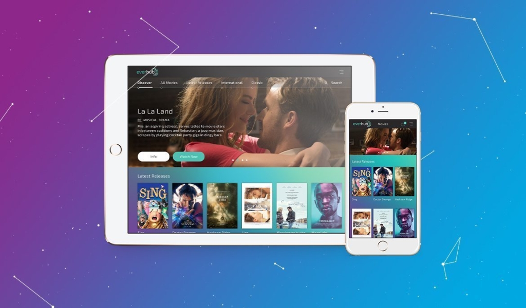
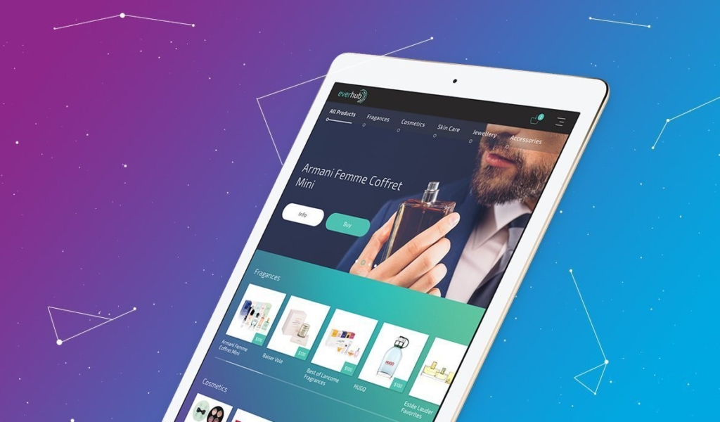
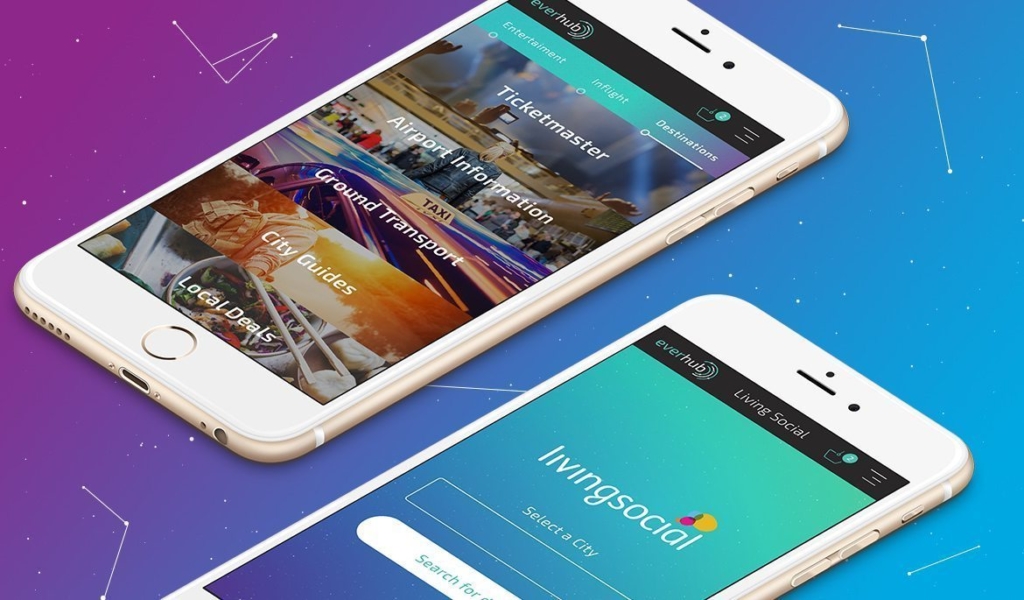
We incorporated the new branding into Everhub’s UI using colour, type and a linear style of iconography. Users can easily navigate through the range of services by accessing four menus: Discover, Entertainment, Inflight and Destination services.
Brand Communications
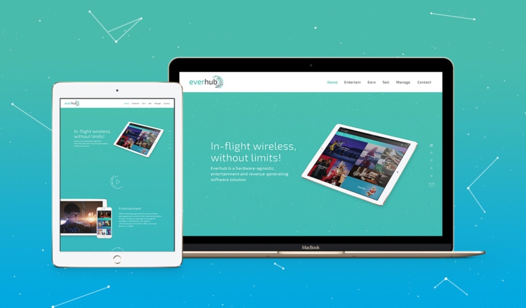
As part of the Everhub™ product launch, our design team created the following marketing channels and materials:
- Website
- Motion Graphics
- Brochure
- Print and digital advertisements
Each piece of communication adapted parts of the brand, by focusing on the four key elements: Discover, Entertainment, Inflight and Destination services. Which delivered a clear, simple, consistent and affective message.
Client
Inflight Dublin
Date
09/2016
Website
http://www.everhub.aero/